import numpy as np
import pandas as pd
import matplotlib.pyplot as plt
import seaborn as sns
%matplotlib inline
The necessary libraries have been imported.
df = pd.read_csv('smoking_health_data_final.csv')
Our dataset has been assigned to the variable df.
df.head()
| LABEL | age | sex | current_smoker | heart_rate | blood_pressure | cigs_per_day | chol |
|---|---|---|---|---|---|---|---|
| 0 | 54 | male | yes | 95 | 110/72 | NaN | 219.0 |
| 1 | 45 | male | yes | 64 | 121/72 | NaN | 248.0 |
| 2 | 58 | male | yes | 81 | 127.5/76 | NaN | 235.0 |
| 3 | 42 | male | yes | 90 | 122.5/80 | NaN | 225.0 |
| 4 | 42 | male | yes | 62 | 119/80 | NaN | 226.0 |
df.isna().sum()
| LABEL | 0 |
|---|---|
| age | 0 |
| sex | 0 |
| current_smoker | 0 |
| heart_rate | 0 |
| blood_pressure | 0 |
| cigs_per_day | 14 |
| chol | 7 |
dtype: int64
In the [cigs_per_day] and [chol] columns, out of 3900 values each, we have only 14 and 7 missing values, respectively.
df = df.dropna()
df.count()
| LABEL | 0 |
|---|---|
| age | 3879 |
| sex | 3879 |
| current_smoker | 3879 |
| heart_rate | 3879 |
| blood_pressure | 3879 |
| cigs_per_day | 3879 |
| chol | 3879 |
dtype: int64
The missing values have been removed from the dataset (a total of 21 values).
df.describe()
| LABEL | age | heart_rate | cigs_per_day | chol |
|---|---|---|---|---|
| count | 3879.000000 | 3879.000000 | 3879.000000 | 3879.000000 |
| mean | 49.543181 | 75.699149 | 9.163702 | 236.629286 |
| std | 8.565955 | 12.023013 | 12.035201 | 44.413846 |
| min | 32.000000 | 44.000000 | 0.000000 | 113.000000 |
| 25% | 42.000000 | 68.000000 | 0.000000 | 206.000000 |
| 50% | 49.000000 | 75.000000 | 0.000000 | 234.000000 |
| 75% | 56.000000 | 82.000000 | 20.000000 | 263.000000 |
| max | 70.000000 | 143.000000 | 70.000000 | 696.000000 |
The average age in the dataset is 50. The youngest person is at least 32 years old, and the oldest is 70 years old.
sns.histplot(data=df, x="age")
sns.set_style("whitegrid")
plt.show()
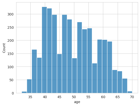
df["age"].describe()
| LABEL | age |
|---|---|
| count | 3879.000000 |
| mean | 49.543181 |
| std | 8.565955 |
| min | 32.000000 |
| 25% | 42.000000 |
| 50% | 49.000000 |
| 75% | 56.000000 |
| max | 70.000000 |
dtype: float64
sns.boxplot(y=df["age"])
plt.title("Age Boxplot")
plt.show()
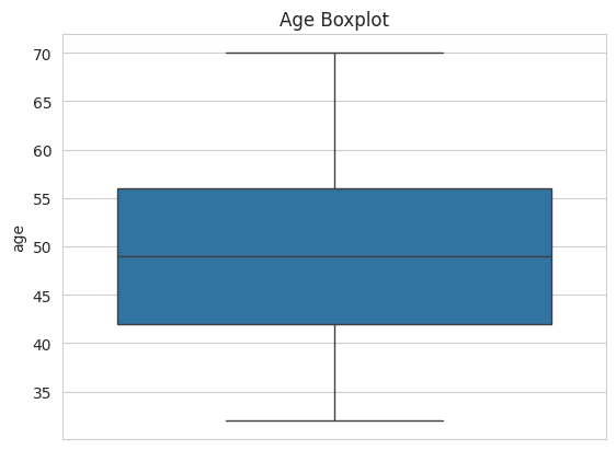
There are no outlier values in the age column of our dataset. The age data appears to be normally distributed.
size = df['sex'].value_counts()
labels = size.index
plt.figure(figsize=(6,6))
plt.pie(size, labels=labels, autopct='%1.1f%%', startangle=90) plt.title("Gender Distribution")
plt.show()
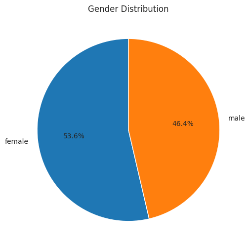
We can see that 53.6% of our dataset is female, and 46.4% is male.
fig = plt.figure(figsize=(12,12))
plt.subplot(2,3,1)
sns.boxplot(y=df["heart_rate"]) plt.title("Heart Rate Boxplot") plt.subplot(2,3,2)
sns.boxplot(y=df["cigs_per_day"]) plt.title("Cigs Per Day Boxplot") plt.subplot(2,3,3)
sns.boxplot(y=df["chol"]) plt.title("Cholesterol Boxplot") plt.subplots_adjust(hspace=0.5, wspace=0.4)
plt.show()
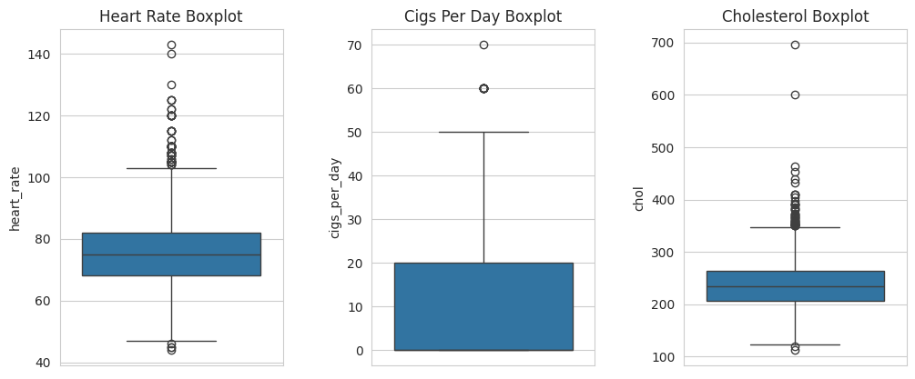
heart_rate
- The median is around 75.
- Most values are clustered between 70–85.
- There are some low outliers (around 40–50 bpm) and some high outliers (120–140 bpm).
- The majority of values fall within normal limits.
cigs_per_day (cigarettes per day)
- The median is close to 0 (very low in the middle of the box).
- Most data points are in the 0–20 cigarettes/day range.
- There are a few extreme outliers, e.g., people smoking 50, 60, or even 70 cigarettes/day.
- A few individuals are heavy smokers.
chol (cholesterol)
- The median is around 240.
- Most values are in the 200–270 mg/dL range.
- There are very low outliers (around 100) and very high outliers (600–700 mg/dL).
- Normal limits (generally <200 mg/dL) are exceeded; many individuals have high cholesterol.
sns.histplot(data=df, x="cigs_per_day", hue="sex") plt.title("Relationship between smoking intensity and gender")
plt.show()
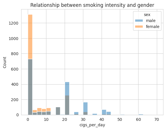
We can see that the majority of individuals who smoke more than 20 cigarettes per day are male.
non_smoker = df[df["cigs_per_day"] == 0]
We are selecting individuals who do not smoke at all.
smoker = df[df["cigs_per_day"] > 20]
We are selecting individuals who smoke more than 20 cigarettes per day.
fig = plt.figure(figsize=(12,10))
plt.subplot(2,2,1)
sns.histplot(data=non_smoker, x="chol", hue="sex", palette={"female": "purple", "male": "cyan"})
plt.title("Non-Smoker")
plt.subplot(2,2,2)
sns.histplot(data=smoker, x="chol", hue="sex", palette={"female": "purple", "male": "cyan"})
plt.title("Smokes more than 20 cigarettes a day")
plt.subplot(2,2,3)
sns.histplot(data=non_smoker, x="heart_rate", hue="sex", palette={"female": "purple", "male": "cyan"})
plt.title("Non-Smoker")
plt.subplot(2,2,4)
sns.histplot(data=smoker, x="heart_rate", hue="sex", palette={"female": "purple", "male": "cyan"})
plt.title("Smokes more than 20 cigarettes a day") plt.subplots_adjust(hspace=0.5)
plt.show()
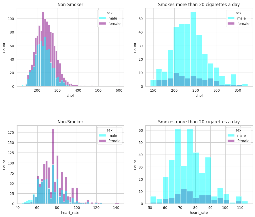
There is no noticeable difference in heart rate and cholesterol between individuals who smoke 20 cigarettes per day and those who do not smoke at all. This may be due to the small number of data points in the dataset.
fig = plt.figure(figsize=(12,10))
plt.subplot(2,2,1)
sns.barplot(x="age", y="cigs_per_day", hue="sex", data=df[(df["age"] > 30) & (df["age"] < 40)], errorbar=None, palette={"female": "purple", "male": "cyan"})
plt.title("Between 30 and 40 years old")
plt.subplot(2,2,2)
sns.barplot(x="age", y="cigs_per_day", hue="sex", data=df[(df["age"] > 40) & (df["age"] < 50)], errorbar=None, palette={"female": "purple", "male": "cyan"})
plt.title("Between 40 and 50 years old")
plt.subplot(2,2,3)
sns.barplot(x="age", y="cigs_per_day", hue="sex", data=df[(df["age"] > 50) & (df["age"] < 60)], errorbar=None, palette={"female": "purple", "male": "cyan"})
plt.title("Between 50 and 60 years old")
plt.subplot(2,2,4)
sns.barplot(x="age", y="cigs_per_day", hue="sex", data=df[(df["age"] > 60) & (df["age"] < 70)], errorbar=None, palette={"female": "purple", "male": "cyan"})
plt.title("Between 60 and 70 years old")
plt.subplots_adjust(hspace=0.5)
plt.show()
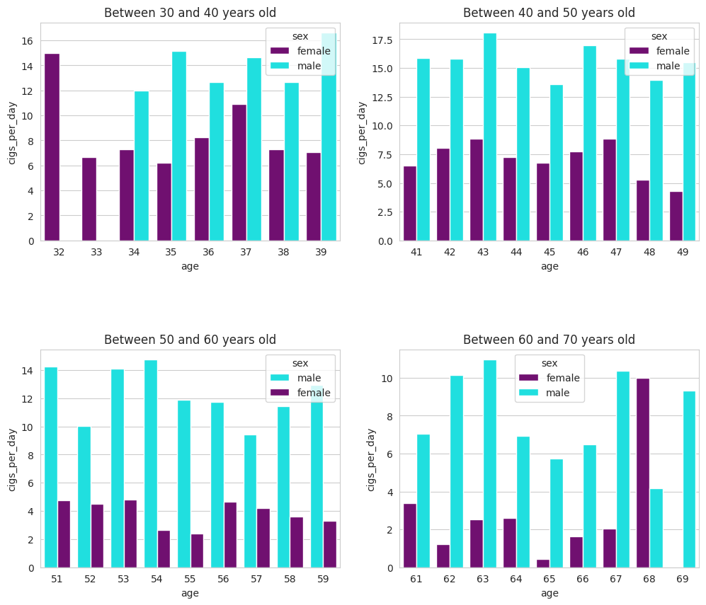
These bar plots allow us to observe cigarette consumption across age groups in comparison with gender. In particular, we conclude that the majority of smokers between the ages of 50 and 70 are male.
fig = plt.figure(figsize=(6,4))
sns.set_style("whitegrid")
sns.lineplot(x="age", y="cigs_per_day", data=df[(df["cigs_per_day"] > 0) & (df["age"] > 50)], errorbar=None)
plt.title("The relationship between age and cigarette smoking") plt.show()
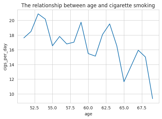
We can see that overall cigarette consumption decreases after the age of 50.
sns.heatmap(df.corr(numeric_only=True), annot=True) plt.title("Correlation Heatmap")
plt.show()
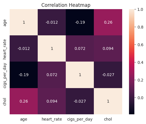
After examining the heatmap, we found that:
- There is a positive correlation between age and cholesterol, meaning that as age increases, cholesterol also tends to increase.
- There is a negative correlation between age and the number of cigarettes smoked per day, meaning that as age increases, the amount of cigarettes consumed decreases.

Yorum bırakın